One of the most important things we strive for at feedly is to enable you to make your feedly as personal as possible. Content-wise, you can do this by finding the best content based on your needs, interests, Must Read sources, and by connecting feedly to your favorite saving and sharing channels. Beyond that, you can customize your feedly even more by changing the look to what best suits your reading style.
We have seven suggestions for you to customize your feedly and make it your very own. Explore even more possibilities in the Preferences section of your feedly, at the bottom of the left-hand navigation panel, or if you’re on mobile, looking for the settings button.
01. What shows up when you open feedly.com
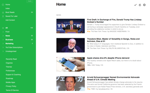
The default start page for feedly is Home, which shows articles from all of your Collections in feedly, in the order that you’ve organized them. To improve your productivity, it might be helpful to have your feedly open to your Must Reads so you can immediately scan your most important content. To change your start page, click on Preferences at the bottom of the left-hand navigation menu and choose from the Start Page options at the top of the screen.
- Home – the top articles from all of your collections, organized by category. Sites promoted to Must Read are more likely to appear in your feedly Home.
- Must Reads – aggregates all the publications and blogs you have marked as Must Read so you don’t miss anything from them. This is only available on Mobile at the moment
- All – shows every single story from all of the sites you follow in feedly, so you won’t miss a single one.
- Index – shows the names your Collections and sites within them, with the unread article count on the right. This serves as a good overview of everything you have in your feedly.
02. Change how your stories look in your Collections
People use feedly for different reasons, and each of your collections may serve a different purpose. One could be full of good reads, another could be necessary to your job, and another could be essential to read every single article regarding a particular topic. Change the view of each collection to fit your working and reading style.
You can modify each collection one-by-one by clicking on the setting icon at the top of the page. Change the view of all of your Collections at once by clicking on Preferences at the bottom of the left-hand navigation menu and changing the Default View to whatever best suits your reading style. There are five different views you can choose from:
- Title only –
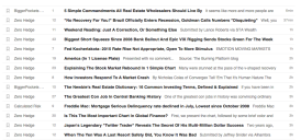 This presents the stories in a long list, so that you can easily see if you have any unreads. It’s similar to how an email inbox would look. We suggest this view for users that need to read every single story in their Collection
 - Magazine –
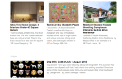 The magazine view is feedly’s default view. The three most popular stories in each collection appear at the top of the page, and the rest are listed with a photo on the left side, plus a small excerpt from the story to capture attention. This makes it easy to scan stories both for good visuals and for good content.
 - Cards –
 Stories are presented as cards in a three-columns view, with a photo to capture attention. This view works well if you like to read stories that involve a lot of graphics, like design or photography.
 - Full articles –
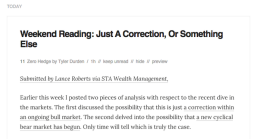 This is a blog-type view. Each story is presented in full so that all you have to do keep scrolling down to read them all, no clicking involved. However, with so much content, it can be difficult to see where each story starts and ends. Full article view is good for users who need to read every single article in a particular collection.
 - Grouped by feeds –
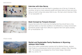 This organizes all your stories based on the site they are from. If, for instance, you want to look at the design blogs you follow in feedly for inspiration but you don’t want them to get mixed up, organize your collection by feed.
03. Add, delete, and edit your collections and feeds
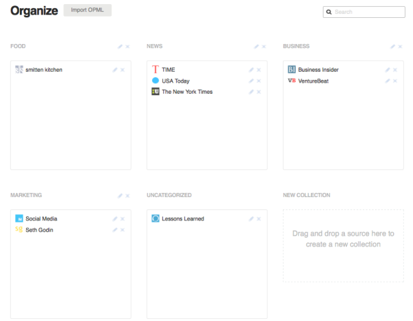
From the Organize page, you can do other useful things, such as changing the name of a collection or blog, moving blogs between collections and deleting collections or blogs. Unfortunately, right now it is not possible to change the order that blogs appear within each collection.
- To change the name of a publication or blog in one of your collections, click the edit icon next to each publication or blog.
- To move a publication or blog to a different collection, simply drag and drop it into the Collection that makes the most sense to you. When you first add a site to your collection, you also have the option of adding it to more than one collection.
- To delete a collection or a blog, simply click the “x” next to it’s name. Another way to delete a publication or blog is by going on their page in feedly and removing through the setting icon at the top of their page in feedly.
04. Organize your Collections with a hierarchy that makes sense to you
Feedly’s goal is to personalize what you read to maximize your productivity, so the best way to make use of your feedly is by ordering sites and categories with a hierarchy that makes sense to you. You can list your more important collections at the top, or organize them based on content.
There are two ways to do this:
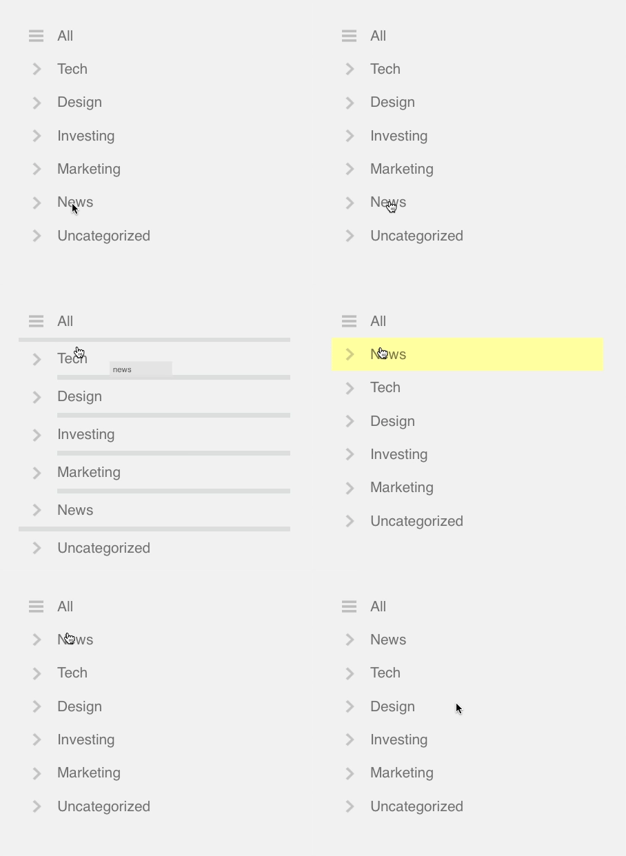
- In the left-hand navigation menu, reorganize your Collections by clicking and dragging each one up and down until you find an order you like. The only category that will stay fixed is “Uncategorized,” which will always be at the bottom. (Shown above)
- Click Organize at the bottom of your left-hand navigation menu. This will take you to a page where you will see each of your Collections laid out in boxes. Drag each box to a place that suits your visual and working needs.
05. Edit your Marked as Read settings
Feedly serves as a tool for millions of readers from all over. Some of those readers prefer if the unread article count is always at a nice, fresh “zero” while others don’t care. With feedly, you can mark and unmark certain articles as read. Usually, once you’ve read an article in feedly it’ll show up as unread by displaying a gray headline instead of a black one. This is helpful if you want to read every single article in a Collection. But sometimes reading every single one can be a little overwhelming, especially if your unread article count is in the hundreds. There are several ways to mark read articles that you haven’t actually read.
- Click on the settings icon at the top of your screen. In the Mark As Read section you can change the amount of time past which you would like an articles to be marked as read. Clicking “All” in the Marked As Read section marks all unread articles in that collection as read.
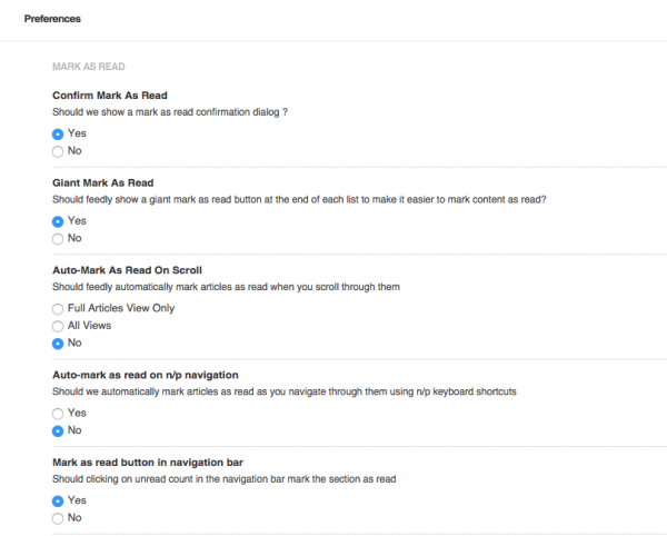
- Click the checkmark at the top of your collection. A popup will ask you if you are sure you want to mark the entire category as read. You can prevent this popup from appearing again by changing your Mark As Read Preferences.
- To change the settings for all of your Collections at once click on Preferences at the bottom of the left-hand navigation menu. Scroll down until you see the Marked As Read section, about halfway down the page. Change these settings based on what you think works best for your reading style.
- Click the unread count in the left-hand navigation menu where all of your Collections are listed. If you hover over the number it will appear with a slash through it, indicating it will mark as
- To mark all articles in your feedly as read, click on the unread count or the circle next to All in the left-hand navigation menu. This is a good way of starting fresh for inbox-zero users.You can turn off this setting by selecting No for the option Mark as read in navigation bar
06. Personalize the color of your navigation menu
feedly’s default colors are white and gray, creating a minimalist look. You can spice up your feedly to match your creative persona be changing the color of the navigation bar. Click on Themes at the bottom of the left-hand navigation menu and choose your favorite color to use for your feedly. The default is set to Modern Gray.
07. Change the font and font size to improve readability
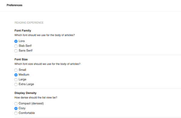
Some people read more productively with different fonts, and certain fonts are easier to read than others. We allow you to personalize your fonts in feedly to maximize your experience and efficiency. To do this, click on Preferences in at the bottom of the left-hand navigation menu and scroll down to a section called Reading Experience. Here, you can change the font, the font size and the density of the text.
08. Change the color of read and unread articles
If you’re trying to read every single article in a feed, it might s be helpful to change the color of unread articles to something that will catch your attention. Make your feedly experience personal by changing it to your favorite color or any color that makes readability easier for you. You can match this to the theme you’ve selected to make your feedly more aesthetically pleasing.
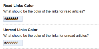
- Click on Preferences at the bottom of the left-hand navigation menu and look for the part that says Unread Links color.
- You can change the #222222 to whatever you want. For instance putting in the code #f80808 changes the color of unread articles to red. Find more codes here!
- You can also change the Read Links Color right above the Unread Links color. Just put in a different code where #888888 is now.
![]()
Source: ARI Feed

Leave A Comment